Toca do Fiapo: Design that Builds a Legacy

A brand redesign project for a building materials store, where the greatest challenge was to transform a posthumous tribute into a symbol of the future and tradition.

mauam_toca_foto_02

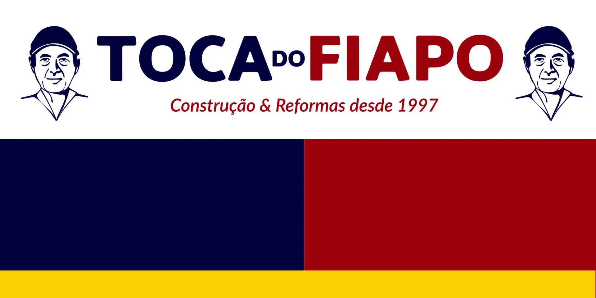
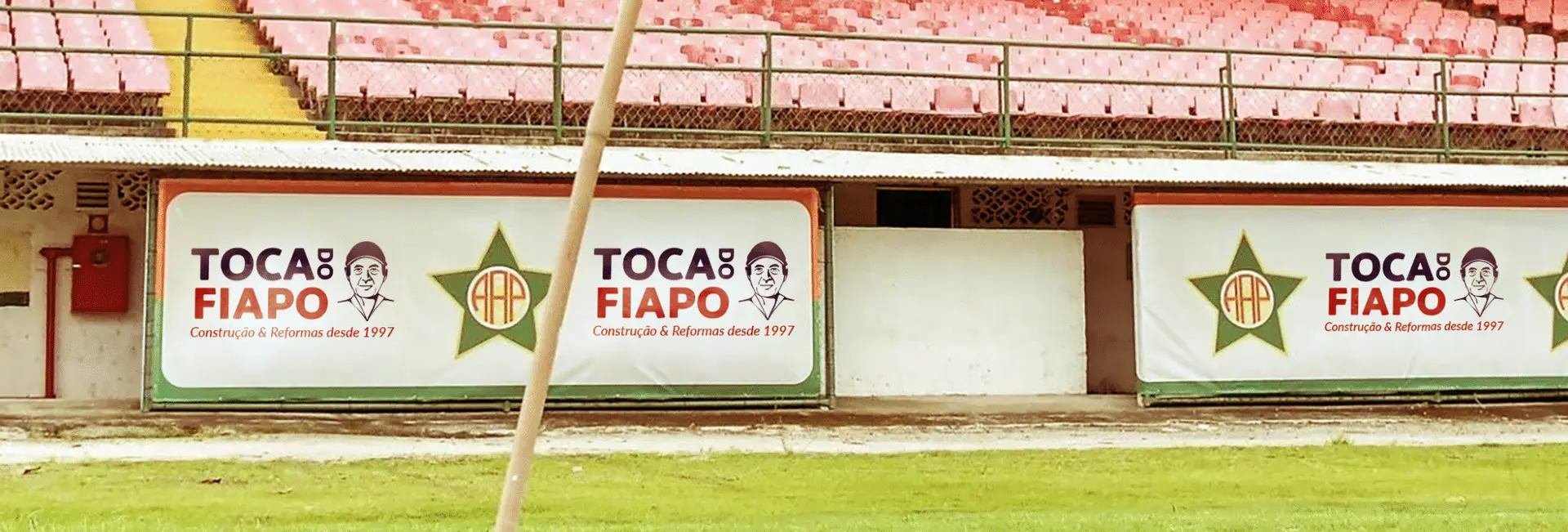
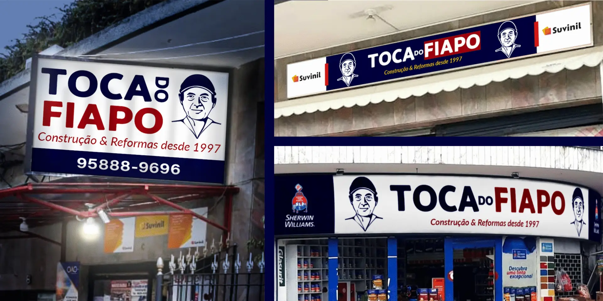
The challenge was twofold and carried great responsibility. We needed to create a visual identity that was a faithful tribute to the founder, Sr. Fiapo, immortalizing his spirit in the brand he built. At the same time, the new logo demanded technical excellence: versatility for print, signage, and, crucially, for embroidery on uniforms, while always maintaining image clarity.

After an extensive and sensitive creative process, the solution was found in the subtlety of perception. Instead of a literal portrait, we opted for a more artistic and conceptual approach. We developed an iconic brand mark built on clean, strong lines.

Within these lines, the shadows and negative space come together to form, in an elegant and respectful manner, the face of Sr. Fiapo. An image that is present even in his absence, revealing the founder at the very core of the identity.

The result is a powerful, modern, and timeless brand. A logo that functions with technical perfection across all applications, from digital to embroidery, and which carries a profound meaning. The tribute transformed the founder’s legacy into a visible pillar of Toca do Fiapo for customers, suppliers, and employees, strengthening the company’s culture and history.

mauam_toca_foto_01

Reimagine your brand with Mauam Branding and Design. 

Connect with us now!

Back to top
en_USEN